They say don’t always judge a book by its cover, but we all know that first impressions make a huge difference to how we perceive things and behave.
YouTube thumbnails are the equivalent of book covers. Someone’s decision whether to click on your video and view it often comes down to how effective your thumbnail is.
Eye-catching and intriguing thumbnails will draw in viewers, while dull, blurry, or simply boring-looking thumbnails will have them overlooking your videos.
So, what’s the answer? How do you create impactful thumbnails?
We’ll answer all that and more in this article.
Jump to a specific section:
- Why are thumbnails so important?
- The basics
- Thumbnail elements
- Tactics
- Competitive research
- Testing & tracking
- Online tools
Why are thumbnails so important?
Put simply, you’re competing for eyeballs on YouTube at all times, and not only with videos on the same topic but with essentially every other video on YouTube.
As an example, you can see the suggested videos in the sidebar in the image below. There’s a range of topics covered, and they’re all competing for the clicks.
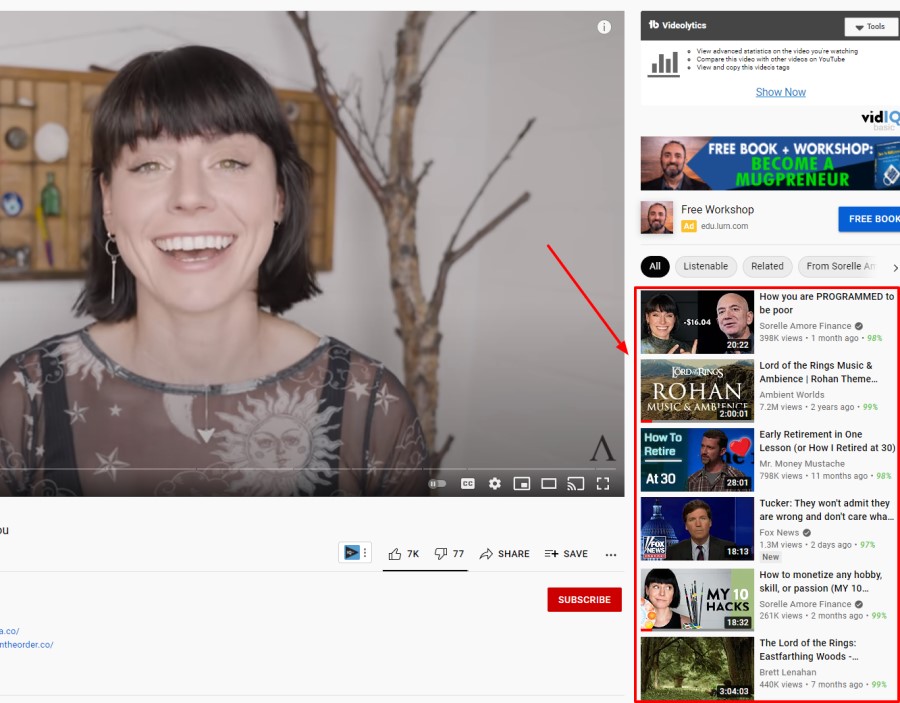
It’s vital to create eye-catching thumbnails because in reality you’re not just competing with similar videos, you’re competing with any video on the platform.
Your thumbnails appear in many different places:
- YouTube search results
- YouTube homepage
- Your own channel page (including playlists)
- suggested videos (sidebar)
- Search engine results pages
- Video embeds
- Curated playlists on YouTube

So with all that potential real estate for your thumbnails, it’s key to get them right (along with your video title) to drive clicks.
Lastly, click-through rate (CTR) is also a significant ranking factor on YouTube.
The Basics
We’ll cover all the steps and tactics to create high-performing thumbnails below but first, it’s important to cover the very basics for your thumbnails:
- Get the sizing right: 1280×720 pixels is ideal (with a minimum width of 640 pixels)
- Aspect ratio: Use a 16:9 aspect ratio
- Use the right formats: JPG, PNG, or GIF file type
- File size: Make sure it’s under 2MB
- Default thumbnails: Don’t just use the default thumbnail YouTube gives your video when you upload one, add a custom thumbnail every time
- Test first: Before you ever go live with your video, test it out to see how it looks on YouTube (particularly when it’s sized down). A good place to check how things look is on a mobile device.
- YouTube policies: Make sure your thumbnail content meets YouTube’s guidelines and policies
- Be efficient – Take photos as you are shooting your videos or use frames from your videos. This saves you so much time as you can use the same setup you have whilst filming and (if your face/body are in the thumbnail) how you look will match the video.
- Foreground stands out – make the forground easily stand out from the background
Thumbnail Elements
There is a lot more to do with your thumbnails than simply creating an image that looks cool and uploading it. You need to do the research and come up with a strategy.
It doesn’t matter how good your video content is if nobody is encouraged to click on your videos. So put effort into your thumbnails (and video titles).
Here are the different elements of effective thumbnails:
Color
The color palette of your thumbnails is very important. Obviously, you want to use a color scheme that stands out, fits your brand, and also helps differentiate you from the competition.
When it comes to how many main colors you should have in your thumbnails, a good rule of thumb is between 2 and 5. Any more than that and things can start to look a bit messy.
Color contrast is also crucial, particularly for the elements that you want to stand out in your thumbnail.
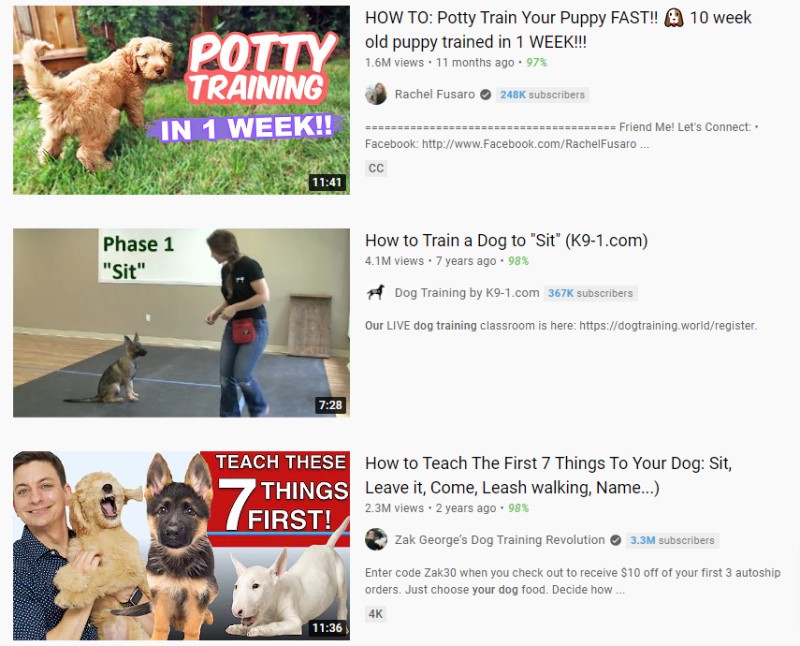
You can see in the image below that the thumbnail and the text in the ‘How to potty train your puppy’ video really stands out because of the color contrast:
Canva has a handy color palette generator that can help with finding colors that work well together. Check it out!
We recommend utilizing vibrant colors to make your thumbnails as eye-catching as possible.
Graphics
Adding quality graphics to your thumbnail can help people understand what your video is about.
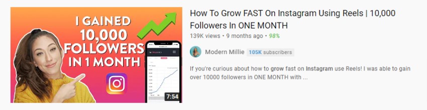
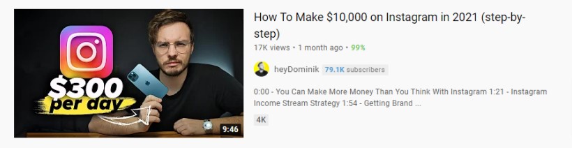
For example, the thumbnail below includes an image of a phone with a graph going up and to the right, a green upwards pointing arrow, and the Instagram icon so it’s easy to glance at this thumbnail and get a clear understanding of what the video is going to cover:
Like color, graphics also help make your videos stand out.
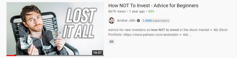
For example, the tick boxes, dollar sign, and YouTube play a big part in helping this thumbnail catch the eye:
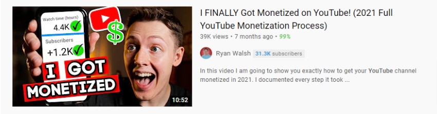
It’s definitely possible to overuse graphics so try and keep a nice balance between a clean-looking and digestible thumbnail, and the number of graphics you use.
Also, don’t mislead potential viewers with the graphics you use (e.g. lots of dollar signs implying that the viewer will learn how to make tons of money).
Make them eye-catching but set realistic expectations with your thumbnails so when viewers watch your video you can deliver on what your thumbnail promises (or hints at).
Text & Fonts
When it comes to the text in your thumbnails it’s very important that you choose the right fonts.
Fonts that are big and bold work best because they are more easily read. Oftentimes having the text in all caps helps with readability too.
Remember, thumbnails are often quite small (especially on mobile devices) so make your text large so that it is very easy to read.

You can see in the image above that YouTuber heyDominik uses large text in very clear and attractive fonts in his thumbnails (as well as a great choice of colors for contrast).
What he also does really well is to often include a keyword(s) in his thumbnails e.g. “SEO”, “Reels Hack”, “New hashtag” so if someone searches for that topic and see his thumbnail they’ll see that there’s a good chance it will answer their query well.
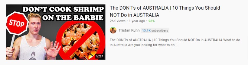
You can also use text in thumbnails to create emotions or anticipation with potential viewers e.g. tension, mystery, intrigue, etc.:
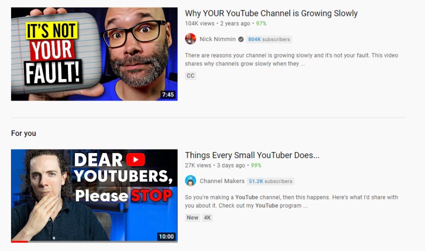
You can see good examples in the image above. For example, with Nick Nimmin’s video thumbnail you might be thinking “Why wouldn’t it be my fault?” or with the second video, you might be intrigued to find out what you should stop doing as a small YouTuber.
Test to see what works best with your niche and audience but creating these emotions in viewers can help your videos get more clicks.
Structure and layout
In general, you should keep your thumbnails simple and clean. If there are too many elements then people won’t know where to look.
Even super minimalist thumbnails can work.
For example, Matt D’Avella uses no text in his thumbnails but gets plenty of views, partly because he creates emotional responses with the imagery in his thumbnails.

However, it’s worth keeping in mind that he had already built an audience up when he went to this strategy but nevertheless it might be something you could test on your channel.
Whatever approach you take with your thumbnails, make sure they are clean, readable, and easily digestible, and you’ll be off to a good start.
Going back to heyDominik, his thumbnails are great examples of how to structure them for a clean and digestible (and eye-catching) look:
Overall Message
The final element of your YouTube thumbnails is the overall message. Essentially you want your thumbnail to encapsulate the story of your video.
Obviously, if there’s a mismatch between your thumbnail and your video content people will not stick around very long (and they definitely won’t subscribe either).
So catch their attention, entice them, get them to click on your video but make sure you meet their expectations with your video content too.
Here’s a couple of good examples:
These thumbnails do a great job of getting the idea across, they could easily be described in one sentence. So aim for a similar setup with your thumbnails make sure they tell a story that you can outline with one sentence and you should be on to a winner.
Thumbnail Tactics
Here are some things you can try out with your thumbnails.
Depending on your brand, niche, competition, and other factors they won’t all be feasible or relevant to your channel.
But some of these might be worth testing out to see if you can make your thumbnails stand out even more.
Faces
You don’t have to show your face in your videos or your thumbnails but if you can it really can help improve your thumbnail performance.
People connect with other people (there’s a part of the brain that is hardwired for facial recognition).
So if you’re comfortable doing it, we recommend getting on camera in your videos and using your beautiful face in your thumbnails too.
This can help you connect with your target audience but it also means competitors can’t copy you exactly (unless they have a clone of you).
Typically most YouTubers use classic facial expressions e.g. happy, sad, surprised, fear, anger, disgusted, etc. and these expressions will naturally match the theme or the feeling in the video content itself.
The facial expressions that YouTubers use in their thumbnails are often a bit over-the-top and depending on the style of your channel (or if it’s a business YouTube account) you might not want to represent yourself this way.
However, if you think it could work for your channel and content it’s definitely worth testing out.
Once viewers have seen your videos a few times (and hopefully enjoyed them), seeing your face again will likely improve your click-through rate.
Remember, if you are going to use faces in your thumbnails, go with close-ups.
Pointing
This tactic is pretty simple (and often used by top YouTubers).
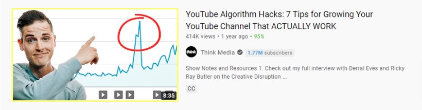
You simply point (with a finger or an arrow) to an important element in your thumbnail image. Usually, this is the YouTuber pointing to something that they’re going to cover a lot in the video.
It’s a commonly used tactic because it grabs people’s attention.
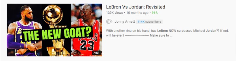
Split images
A great way to clearly represent your video content with your thumbnails is to use split images.
This works best when your video topic is a:
- Before and after
- Versus
- Has 2 subjects (e.g. interview)
For example, the thumbnails below clearly show what the video is all about and what the viewer will learn by watching them:
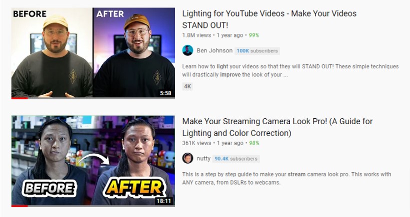
Dividing your thumbnails into two different sections can naturally give it a look of progression which can be a clear and powerful way to tell the story of the video.
If this is the type of video you’re producing then these thumbnails explain everything very quickly to the viewer and get them to click on your video.
Consistency
A good tactic to establish your brand and recognition for your videos is to have consistency in your video thumbnails.
This can be in the colors, the structure, or even something as simple as always having your logo on a specific spot in your thumbnails.
Some big brands like Vice consistently use their logo in their video thumbnails. Obviously, they’ve built up significant brand recognition over the years so when people see their logo they instantly know who created the content.

But this is something you can do with your videos too, consistently use your logo (or even your brand colors) and overtime as your brand recognition builds this could become a significant driver of clicks to your videos.
Keep in mind that the downside of always using a logo in your thumbnails is that it takes up valuable space. So you’ll need to decide whether it makes sense for your channel or not.
Research the competition
Now that you know some awesome YouTube thumbnail tactics, it’s time to research the competition (assuming you have a topic chosen).
Look at channels that are targeting the same audience as you.
What kind of thumbnails do they use, what are the typical features of their thumbnails?
Take notes, and then think of ways you can improve on them, and also differentiate yourself.
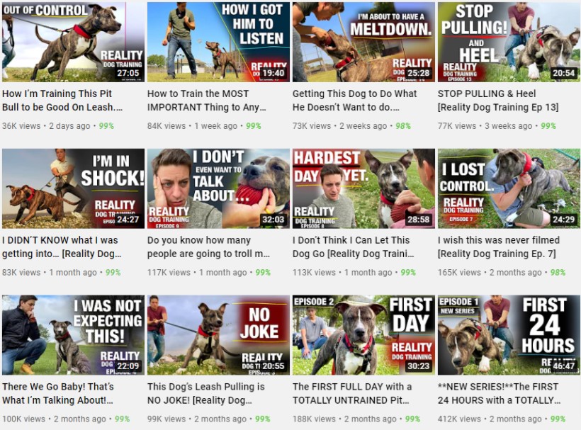
Let’s go through an example, with three channels in the dog training niche:
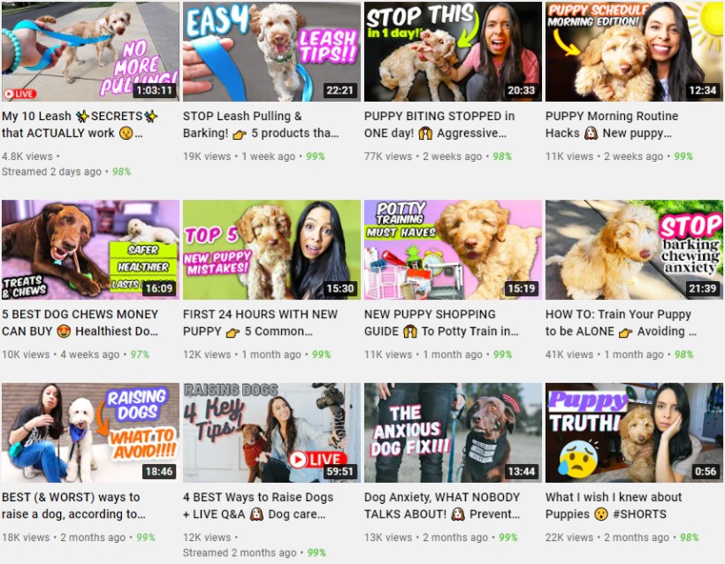
Notes:
- Dog is the primary focus in every thumbnail (no surprise)
- Dog doing relevant action in some thumbnails (e.g. being on the leash or chewing)
- Person’s face often in thumbnail, showing relevant emotion
- Bright colors and pretty clear text
- Use of arrows to focus on main subject
- Typically between 3 and 5 words used in thumbnail
- All thumbnails contain text
- Text typically to the right or left side of thumbnail
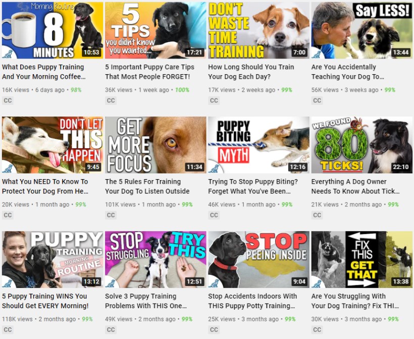
Notes:
- Dog is the primary focus in every thumbnail
- Dog doing relevant action in some thumbnails
- Person’s face only in a couple of thumbnails
- Bright colors and clear text
- Typically between 3 and 4 words used in thumbnail
- All thumbnails contain text
- Tex on left, right, and middle of thumbnail
Notes:
- Dog is the primary focus in every thumbnail
- Dog doing relevant action in some thumbnails
- Person’s face only in some thumbnails with relevant emotion or pose
- Very clear text
- Typically between 3 and 5 words used in thumbnail
- All thumbnails contain text
- Text typically to the left or right of thumbnail
- Branding used in every thumbnail
- Consistent color palette
So based on those 3 channels, here’s where you could start with your thumbnails:
- Use an image of a dog in all thumbnails
- Have the dog doing a relevant action or sitting in a relevant pose
- Use between 3 – 4 words
- Use bright colors
- Make the text and font very clear
- Use text on the left or right side
- Show a human face (with emotion) where relevant
The next step is to test and see what works.
Testing & Tracking
If you’re going to test out different variations of your thumbnails the best approach is to do an AB split test.
This is simply testing the performance of a new version of a thumbnail versus the original version to see which one gets the best click-through rate.
You can take two approaches to this.
Either test out a completely different version of the thumbnail (which will make it difficult to understand what made the biggest difference if the performance improves or declines).
Or simply change one element of the thumbnail (e.g. the text) to see how that impacts the performance. This approach will give you clearer insights into what makes the difference.
The easiest way to AB test your thumbnails at the moment is to use a tool like TubeBuddy.
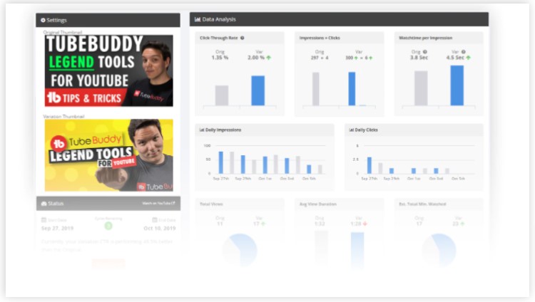
Doing AB tests this way allows you to create a consistent feedback loop.
This simply means you can consistently get new learnings on what works best in your thumbnails, keep conducting tests over time, and you’ll see constant improvements and feedback.
Apply those learnings to your next video thumbnail, test, learn, and so on.
If you’re getting upwards of 400 clicks per video, this is a good enough starting point for an AB test.
Anything less than this, and you’ll likely have to wait until you get a bit more video views before you start testing.
If you don’t want to invest in a premium TubeBuddy account (to get the AB test functionality) you can simply track the CTR performance in YouTube Creator Studio.
The “impressions click-through rate” in the dashboard tells you the CTR performance.

If one of your videos has a low CTR compared to your typical performance it could be a good opportunity to test out a different version of the thumbnail to see if you can improve things.
AB tests you could do
If you’re not sure what elements of your thumbnails you could test, here are some ideas for you:
- Main thumbnail element – Every thumbnail should have a main element, and you can test the positioning of it. Typically left, right, or centred. You can also test different ways of highlightign it such as circles, arrows, pointing to it, etc.
- Color scheme – brighter vs duller colors, different color palettes, etc.
- Fonts – test out different fonts that might be more distinct and readable
- Background – images, solid color, gradients, blurred, etc.
- Text amount – test out how much text you’re using in the thumbnails – more vs less, less vs more, some vs none, etc.
- Text content – blunt text vs teasing text e.g. what your video is about vs leaving a bit of mystery to what your video is about. A great thing to test is also by asking a question in the thumbnail (implies you know something the viewer doesn’t).
- Facial expressions – very expressive vs not so expressive, etc.
- Number of main elements – test out having between 1 to 3 main elements in your thubmnail
Tools to create YouTube thumbnails
There are plenty of tools you can use (here are some of the best) but you can’t go wrong with Canva, Placeit, or Snappa.
If you know how to use Photoshop or any other graphic design software, that’s great! But online tools can be just as useful, albeit they don’t give you as much freedom.
They do offer templates though, so they can make it incredibly quick and easy! And if you save templates on those platforms of your designs, you can reuse them, again and again, to ensure you have the same filters, colors, fonts, layouts, etc.
Wrapping things up
So, there you have it, that’s how you create good YouTube thumbnails.
Stick to the basics, understand who you are targeting, test, refine, and keep improving the quality of the thumbnails and over time you will see success.
Enjoy creating! Oh, and if you have any questions, comments, or suggestions for creating awesome YouTube thumbnails, leave a comment below!